
 and
and 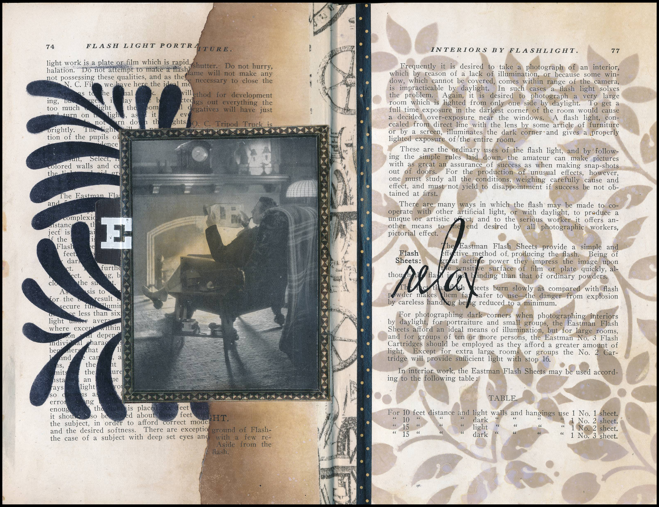
Here’s an example of a “flap” page. I tore out HALF a page out of my art journal, and made it into a flap that can be viewed from either side. The trick to flap pages is that it should look attractive and balanced when viewing both the front and back of the flap.
To create this two-pages-in-one look, I applied Distress Ink using blending tools to the flap and the left page to darken the left side of the page. I then lightly blended ink onto the right page, as well. I used blending tools, stencils, and black Distress Ink to apply a palm-like frond to the left page, and a lighter colour of ink to apply a floral stencil pattern to the right page. Once the backgrounds were complete, I focused on the images mounted to the flap.
I used a Tim Holtz image on the “play” side, and an image cut from another page of my art journal on the “relax” side. The words “play” and “relax” are rub-ons.
I added a tab to the flap to make it obvious that one should grab the flap and flip it — and embellished the tab with rub-ons.
I like the way this page shows two different sides to life: we need to play, and we need to relax. Both are important!
