
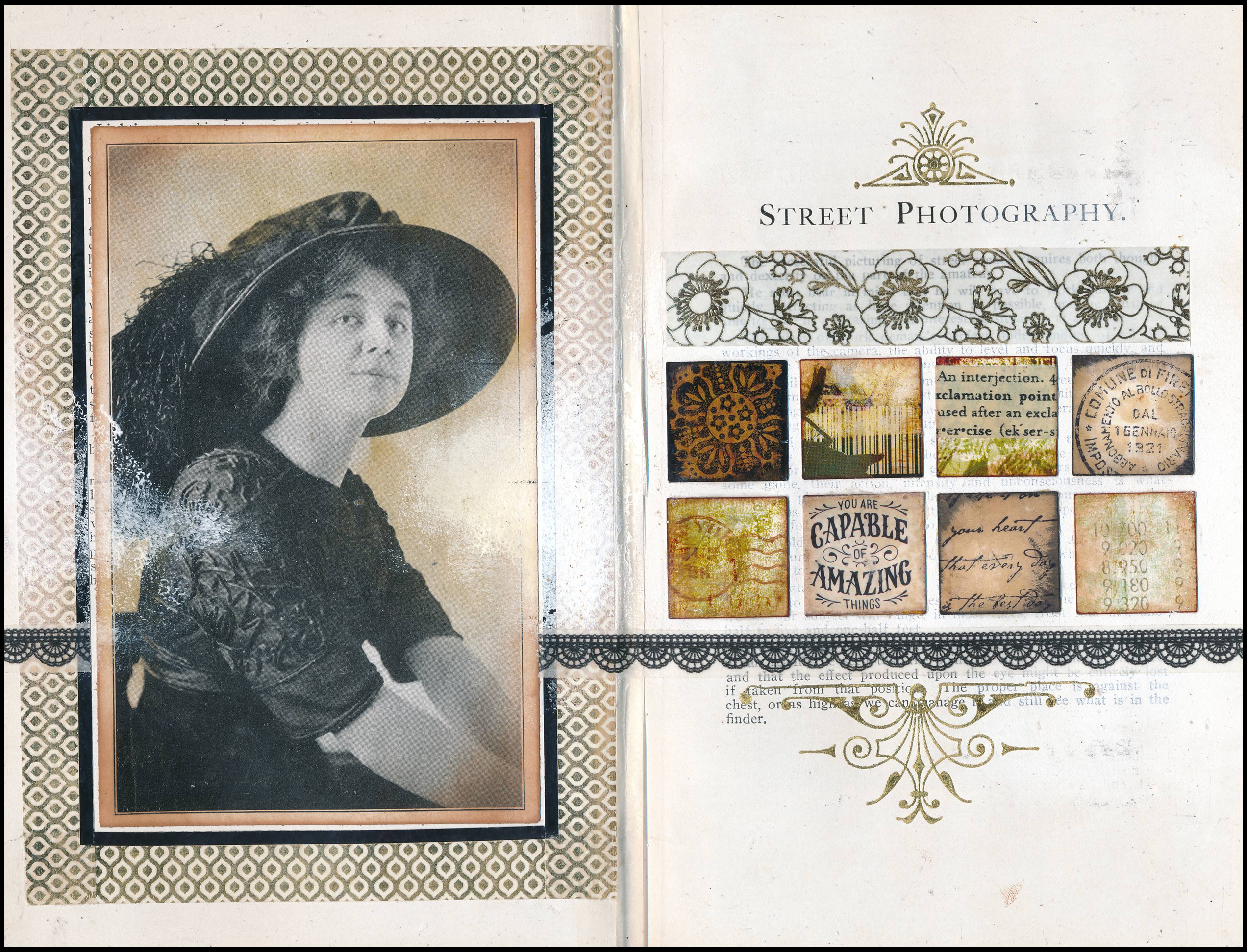
 Is the image on the left side black-and-white, or sepia toned? I think it’s both! Instead of leaving the black-and-white photo as is, I inked around the background behind the woman using blending tools and Distress Ink, creating a faux sepia look while leaving the lady all in gray tones. I like the way this made her “pop” — especially after adding washi tape borders around her.
On the right side of the page, I applied gesso over the text on the right side of the book, partially whiting it out while leaving some of the text still visible. I punched small squares from paper scraps, inked the edges of the squares, and rubber stamped them with words and patterns, and adhered them to the page. I then used washi tape and metallic gold rub-ons to finish off the right side of the page. Lacy-looking washi tape extends across both sides of the page, tying them together.
Sometimes “big” and “small” go well together, as demonstrated with this page. A large picture on the left balances out the small details on the right, creating a balanced look.
